Rhetorical Analysis
Tuesday 10 April 2012
NESCAFE
This ad uses appeal to logic very well. As everyone known,
people always drink coffee for keeping clear mind. The picture
shows that Exhaustion will disappear with the steam of coffee. So
you will stay awake if you drink NESCAFE’s coffee. There is no any
text, thus simple and direct, but it is very easy to get the meaning. To
customers, they will like to try it when they are sleepy and tired. And
the background color also use well. Red is the color which represents
attention.
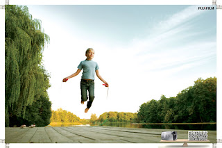
Ad of Fujifilm Camera
Obviously, the ad want to tell
customers that the advantage of
this camera is to take objects in motion. This ad
appreals to
authority. Both photos are very normal, they do not choose the
picture which is fantastic. They are sure who is their audience, this
camera is
designed for normal people and daily life. The camera is
not designed for
professional people, so these photos just look like
the photos which can be
taken by everyman. The ad also appeals to
emotion, all people appear in the
picture have smile faces. So you
can catch happiness if you have this camera.
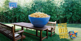
An Exaggerated Advertisement of food
This is the ad of food. And the advantage
of the food is “Big Cheese”, so the ad focous on how big it is. Food ads are
also different to advertise because the taste is hard to be visualization. So the
ad uses huge bowl and food to show it is value-for-money product.
But manufacturer makes a mountain out of a nolehill, they
try to confuse costumers. They want to say the cheesy taste, but they change the
size of the products. Some audience, especially children, will misunderstand
that it is as big as the one in the picture.
WWF Ad
This is an ad of WWF(World Wildlife Fund – an organization to protect wild animals). This ad appeals to emotion. They try to express how poor the wild animals are if we do not timely protect them. The whole picture use very dark color to express the sad emotion. The desertificate elephant shows the dangerous situation they face and the hostile environment they live in. The ad also indicates wild animals grasually decrease, and if we do not pay attention to this, some of them probably disappear forever. The ad appeal audience to protect wild animals.
Monday 9 April 2012
Watered Up
This ad uses appeal to emotion to show its value in two aspects. The first one is the spilling water. Although the entire background color is dark grey, linghting becomes brighter when dipicting the water; therefore, the patten and the transparency of the liquid water, even the spattering sprays can be seen clearly. Besides that, the shape of the water forms a woman's body skillfully. By using this way, the designer shows his audience this product is very mosturizing and can keep people's body fresh. The second one is the phrase "watered up", it also expresses this product's value that people whoever use it can be full of water for a long time.
Packaging of Russian Beer
This is beer, not coffee. Which
attrach my attention is the unique
packaging. In our opinion, beer only appears in pub or home, but the packaging
break the logic. It looks same like coffee, so it can be taken everywhere. This
is the “walking” ad for the pub. Breaking rules is the most important point to
the ads and packaging, and this beer is the most successful example of breaking.
The audience is probably the white collars in cities. The beer reminds them do
not forget to relax after hard work. Actually, this beer is from Russia, so it
is not hard to understand the reason of using coffee packaging. Drinking
culture in Russia is well-known all over the world. Their drinking culture just
likes the coffee culture in North America. It is also an ad for the culture of
their country.
Poster of Organ Donation Organization
This is a picture poster of IMIP - an
organization of organ donation. “One of these two will
get your organs. You decide.” Combining of text and image, if you do not donate
your organs to the girl or the people who very need healthy organs, your organs
will be garbage when you die. So what is your choice? This ad is very incisive.
The ad precisely shows the two different applications of our healthy organs.
The poster
uses a large area of green. It is known to all that green is the color of life.
It means the choice we choice concern to one’s life and health. This is an ad
can make people think deeply.
Subscribe to:
Posts (Atom)


